FINDING COLOUR
2018
Turner Galleries
Perth WA
COLOUR THEORIES
COLOUR SYSTEMS
LEXICAL SPECTRUMS
LEXICAL SPECTRUMS DEFRAGMENTED
FINDING COLOUR is a selection of paintings from the past twenty years developed from a range of unique and systematic frames of reference, each revealing inherent structures from their underlying sources explored through the materiality of paint.
My interests lie in colour, the descriptions of natural phenomena and visual systems. All of my sources are everyday ‘already mades’: painted objects, books, dictionaries, field guides, newspapers, photographs – systems, images, and objects in my environment that generally have some relationship to colour.
The challenge is taking that inkling that “there's a painting in there” through the processes of conceptualisation and realisation.
My approach is flexible. I work with tendencies rather than by rules. I have a preference for little or no pictorial depth which dovetails well with most of my sources. Whether the painting appears to be figurative or abstract depends on how I think I can successfully realise the concept.
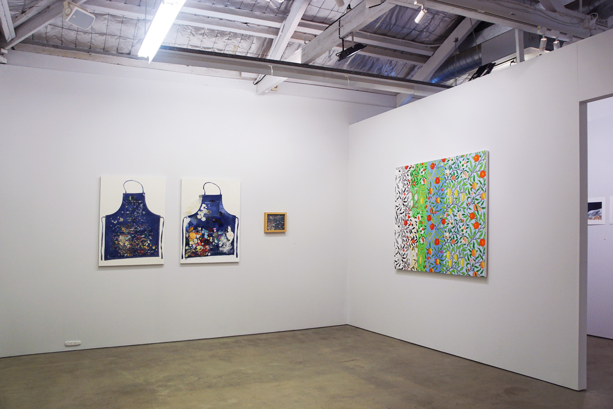
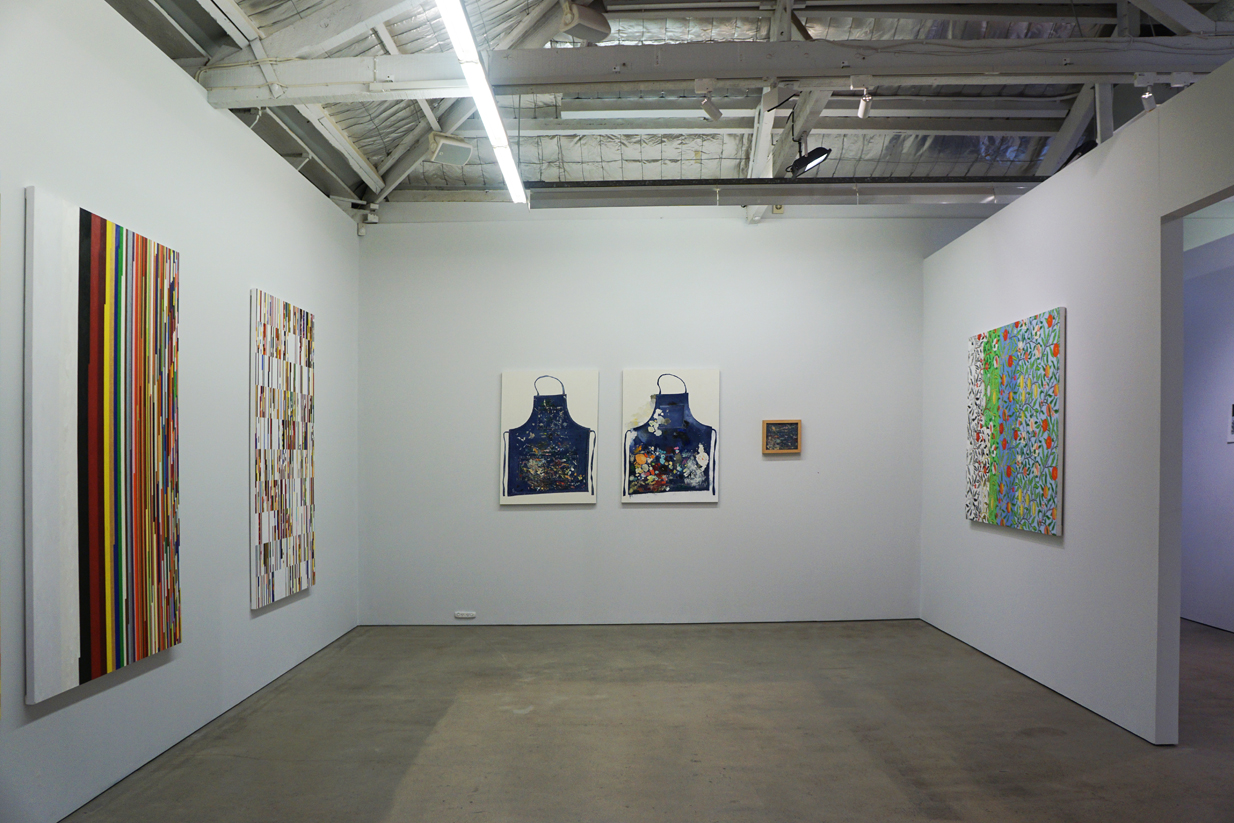
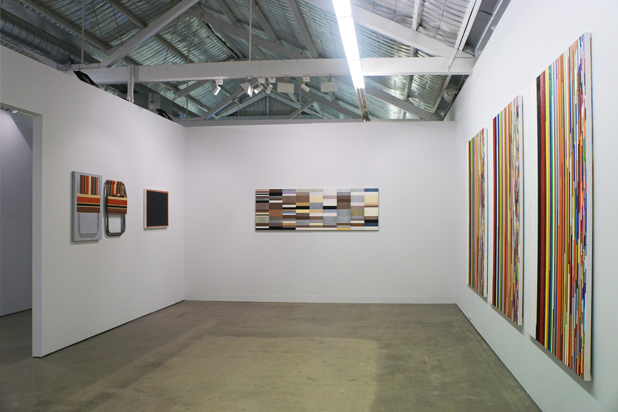
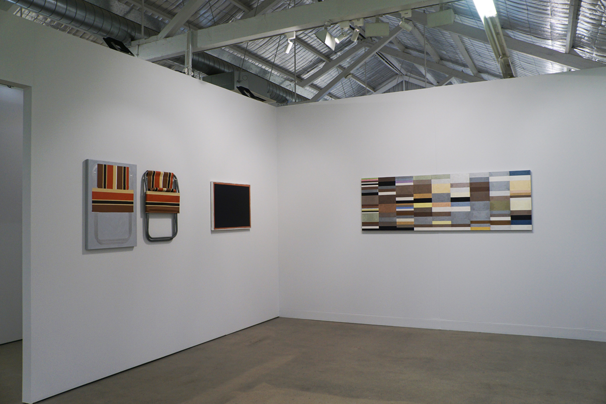
Two early works, ANOTHER APRON DIPTYCH and FOLDED FLAT both concern the painting of, or painting on, previously painted objects: my painting apron and a factory painted canvas deck chair.
Two things happened around the time I was working on these paintings: while shopping for paint I discovered that one manufacturer was now producing gold and silver metallic oil colours; and at a bookstore looking to replace my old, much used, worn out Pocket Oxford Dictionary (POD) I found that Oxford not only still produced the POD but beside it was a much fatter Australian edition. Some years before, I had noted, and circled the colour words in the first twenty or so pages of my POD but was stymied by gold and silver let alone how to make a painting from all those words. I bought gold and silver paint, both dictionaries, and started reading.
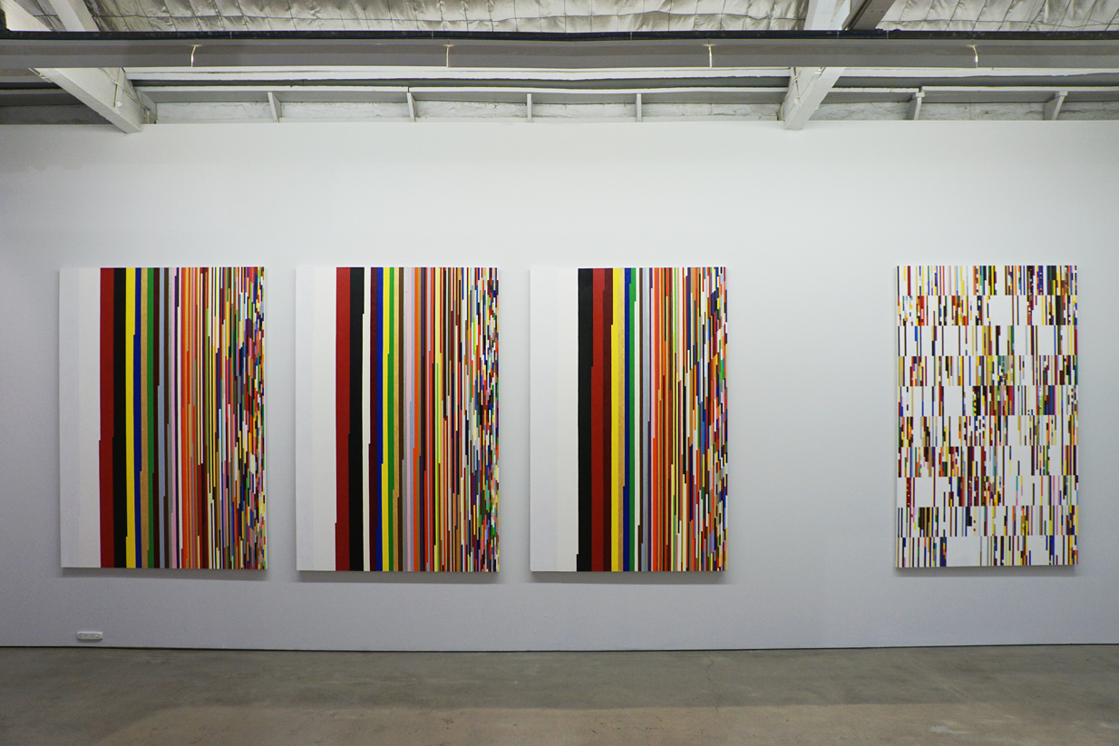
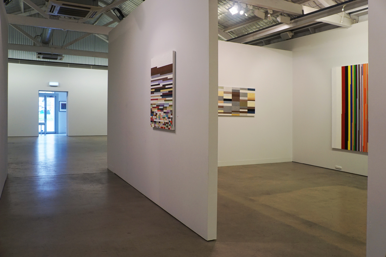
The sources of my paintings aren't intended to be obscure and usually the source is in the title or at least the title alludes to the source. LEXICAL SPECTRUM POD is the first of a series of six paintings. The series was poetically titled by a friend. I probably would have titled it All the Colour Words from the Pocket Oxford Dictionary. In total I read six PODs, edited in five different countries, and listed all the colour words in each. Then I devised a system to paint all those colour words.
Some ideas I've painted more than once in different ways, and some ideas produce variations that require a number of paintings. The three DEFRAGMENTED paintings used the same colour words as three LEXICAL SPECTRUM paintings: the Australian Pocket Oxford Dictionary, the Canadian Oxford Pocket Dictionary, and the South African Pocket Oxford Dictionary. Each title begins with the dictionary acronym followed by Defragmented which refers to a program used by computers when tidying up the hard drive, consolidating like pieces of colour into larger blocks.
Reading dictionaries led me to take a closer look at other reference books in my library. I've since made paintings from colour descriptions found in a number of different field guides. The information for SHARK COLOURS was found in a Department of Fisheries publication, Field identification guide to Western Australian Sharks and Shark-like Rays. EGG COLOURS DEFRAGMENTED was based on detailed descriptions of the eggs of Australian birds from What Bird is That by Neville Cayley.
EVOLUTION ORCHARD comes from a theory of the order that colour words entered developing languages from Basic Color Terms, Their Universality and Evolution by Berlin and Kay. Orchard refers to a William Morris design with a nice balance of the colours I required in a repeating pattern across a flat surface.
VENETIAN BLACK is based on the analysis of paint layers in a speck of black paint from a Titian painting described in Venetian Colour by Paul Hills. “Broadly speaking, Titian moved from warm mixtures, including vermillion and (burnt) ochre in the underglazes to cooler ones, including azurite and (dark) violet lake in the final layers. Five of the layers contain some lead white, a very dense pigment which tips the mixture towards opacity and in turn makes it cooler. By overlaying cool over warm, Titian induced a dusky silver to hover over ebonies and sables.” Ten layers were found, in that speck of black paint, all mixed colours. Few of the colours Titian used are still in use today so I had to figure out the closest substitutes. I had to start again three times until I got the layers thin enough, all in order to find the hovering dusky silver.
2018
Turner Galleries
Perth WA
COLOUR THEORIES
COLOUR SYSTEMS
LEXICAL SPECTRUMS
LEXICAL SPECTRUMS DEFRAGMENTED
FINDING COLOUR is a selection of paintings from the past twenty years developed from a range of unique and systematic frames of reference, each revealing inherent structures from their underlying sources explored through the materiality of paint.
My interests lie in colour, the descriptions of natural phenomena and visual systems. All of my sources are everyday ‘already mades’: painted objects, books, dictionaries, field guides, newspapers, photographs – systems, images, and objects in my environment that generally have some relationship to colour.
The challenge is taking that inkling that “there's a painting in there” through the processes of conceptualisation and realisation.
My approach is flexible. I work with tendencies rather than by rules. I have a preference for little or no pictorial depth which dovetails well with most of my sources. Whether the painting appears to be figurative or abstract depends on how I think I can successfully realise the concept.
Two early works, ANOTHER APRON DIPTYCH and FOLDED FLAT both concern the painting of, or painting on, previously painted objects: my painting apron and a factory painted canvas deck chair.
Two things happened around the time I was working on these paintings: while shopping for paint I discovered that one manufacturer was now producing gold and silver metallic oil colours; and at a bookstore looking to replace my old, much used, worn out Pocket Oxford Dictionary (POD) I found that Oxford not only still produced the POD but beside it was a much fatter Australian edition. Some years before, I had noted, and circled the colour words in the first twenty or so pages of my POD but was stymied by gold and silver let alone how to make a painting from all those words. I bought gold and silver paint, both dictionaries, and started reading.
The sources of my paintings aren't intended to be obscure and usually the source is in the title or at least the title alludes to the source. LEXICAL SPECTRUM POD is the first of a series of six paintings. The series was poetically titled by a friend. I probably would have titled it All the Colour Words from the Pocket Oxford Dictionary. In total I read six PODs, edited in five different countries, and listed all the colour words in each. Then I devised a system to paint all those colour words.
Some ideas I've painted more than once in different ways, and some ideas produce variations that require a number of paintings. The three DEFRAGMENTED paintings used the same colour words as three LEXICAL SPECTRUM paintings: the Australian Pocket Oxford Dictionary, the Canadian Oxford Pocket Dictionary, and the South African Pocket Oxford Dictionary. Each title begins with the dictionary acronym followed by Defragmented which refers to a program used by computers when tidying up the hard drive, consolidating like pieces of colour into larger blocks.
Reading dictionaries led me to take a closer look at other reference books in my library. I've since made paintings from colour descriptions found in a number of different field guides. The information for SHARK COLOURS was found in a Department of Fisheries publication, Field identification guide to Western Australian Sharks and Shark-like Rays. EGG COLOURS DEFRAGMENTED was based on detailed descriptions of the eggs of Australian birds from What Bird is That by Neville Cayley.
EVOLUTION ORCHARD comes from a theory of the order that colour words entered developing languages from Basic Color Terms, Their Universality and Evolution by Berlin and Kay. Orchard refers to a William Morris design with a nice balance of the colours I required in a repeating pattern across a flat surface.
VENETIAN BLACK is based on the analysis of paint layers in a speck of black paint from a Titian painting described in Venetian Colour by Paul Hills. “Broadly speaking, Titian moved from warm mixtures, including vermillion and (burnt) ochre in the underglazes to cooler ones, including azurite and (dark) violet lake in the final layers. Five of the layers contain some lead white, a very dense pigment which tips the mixture towards opacity and in turn makes it cooler. By overlaying cool over warm, Titian induced a dusky silver to hover over ebonies and sables.” Ten layers were found, in that speck of black paint, all mixed colours. Few of the colours Titian used are still in use today so I had to figure out the closest substitutes. I had to start again three times until I got the layers thin enough, all in order to find the hovering dusky silver.